
Independent family brewer Timothy Taylor’s has unveiled its first major brand refresh in more than a decade as part of “a long-term investment into the future of cask ale”.
While the look is evolving, the beer and brewing philosophy remain exactly the same, says the brewer.
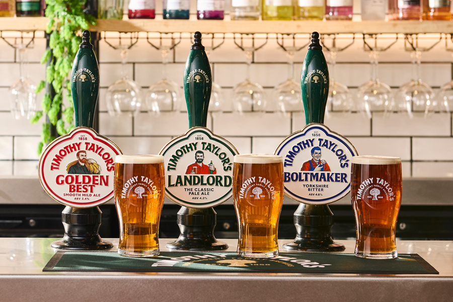
The new identity includes an updated logo, pumpclips, glassware, and bottles. It introduces a British Racing Green colour palette, informative beer descriptions, and more premium finishes. These are designed to help the range feel more distinctive and relevant, without moving away from the heritage and character of the Timothy Taylor’s name.
The brewer is investing £9 million in its brewery site over five years, and £3m annually in marketing. Additionally, it wil continue to support pubs through its nationally-based business development manager team, who work closely with publicans and trade partners to deliver quality and consistency.
The brand refresh follows continued momentum for the brewer, with its flagship ale, Timothy Taylor’s Landlord, continuing to grow its position as the UK’s best-selling cask ale brand by both value and volume.
“For 168 years we’ve believed that if you brew great beer properly, people will keep coming back to it,” said Andrew Carter, chief executive of Timothy Taylor’s. “That’s why this refresh isn’t about changing what we brew. The recipes, ingredients and brewing philosophy that have served us for generations remain exactly the same.
“It’s about making sure the quality and care that go into every pint are reflected in how Timothy Taylor’s is presented today, so we’re just as relevant to the next generation of drinkers as we’ve been to the last.
“We’ll continue to invest in our brewery, our people, and our pub partners because great cask beer depends on every stage of the journey, from brewing to the moment it’s poured. That commitment is every bit as important today as it’s always been.”