Shepherd Neame has revealed a fresh new look for one of its most iconic bottled ales, Bishops Finger, which was first brewed in 1958.

It was the first strong ale produced by the Faversham brewer and pub owner following the end of 20 years of malt rationing.
The beer takes its name from an ancient Kentish signpost found on the Pilgrim’s Way which pointed travellers towards Canterbury and the shrine of Thomas à Becket in the city’s world-famous cathedral.
A rich and fruity ruby ale, Bishops Finger has won numerous awards, including world’s best bitter at the 2024 World Beer Awards. It holds EU Protected Geographical Indication in recognition of its unique provenance as a Kentish Strong Ale.
Originally brewed to an historic charter, the recipe is a closely-guarded secret with the head brewer, and every batch is tasted through the process to ensure it meets the highest standards before release.
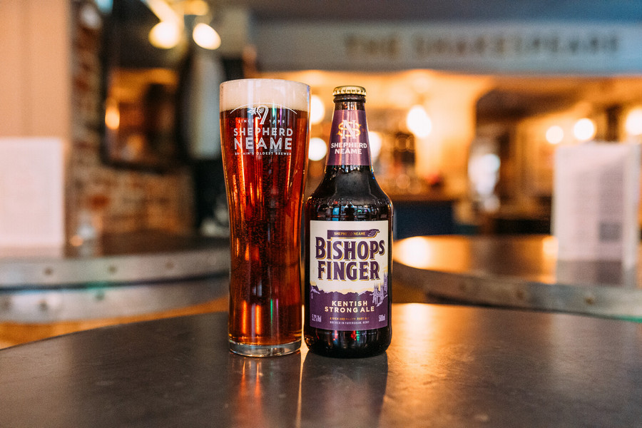
The refreshed design retains the purple, gold, and cream colour palette, but introduces a more contemporary look. A new hand-drawn illustration of Canterbury Cathedral is now the main focus, and it also includes a reimagined Shepherd Neame monogram. The new look has been developed in partnership with creative agency Thirst.
“We are continually investing in our award-winning collection of beers,” said Shepherd Neame’s head of brands, Rose Davis. “More than six decades since it was originally launched, Bishops Finger remains one of the most popular beers in our portfolio, and we are very proud to unveil its bold new look.
“Our aim was to invigorate this signature Kentish classic with contemporary flair while celebrating everything that makes it special — its history, unique brewing status, and uncompromising craftsmanship. We want to ensure that Bishops Finger continues to thrive for many years to come.”